


The metal bands ruled this category in the 80's. There were a few exceptions, but for the most part metal bands were the only ones being artistic with their names and identity. I hope you enjoy the list.
Honorable Mentions
Quiet Riot
Iron Maiden
Devo


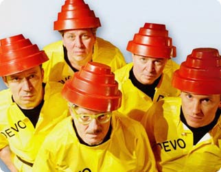
These three were not band logos, per se, but there wasn't anybody back in the 80's who didn't see the Quiet Riot maniac mask, Iron Maiden's ghoulish undead Eddie, or Devo's brilliant use of a collapsible cup and not know exactly who was being represented.
I thought these three deserved at least honorable mentions for their brilliant use of these images. Don't you agree?
#10
Asia
The eyes on the bottom weren't always there, but the top always remained the same. Asia was a band made up of former members of various successful groups. They were considered a "supergroup" and there music showed that to be true. This logo, using the letters of the band name in a pyramid design, was befitting the great band.
#9
Twisted Sister

Great concept here. Just take the first two letters of each of the words in the band name and do to them exactly what the first word says, twist them.
Considering most people didn't know whether to like these guy's music or be scared to death of them, Twisted Sister was a perfect name. The logo, in my opinion, is the perfect design to fit the band name and personality.
#8
Metallica
Great symmetrical design. Simple in concept, yet brilliant in design. The first and last letters give the appearance of being tilted sideways and coming forward toward the viewer. This gives the rest of the letters the appearance of sitting further back. The M and the A also have sharp edges that fore sights the edginess of the band's music. Great design.
#7
Def Leppard
You know what was great about this logo? It was easy to draw. Don't knock the importance of this fact either. When your target audience is high school kids, they like to be able to advertise on their notebooks for you.
The sharp edges of every angle in every letter is what defined this great logo.
#6
Night Ranger
Symmetry was a hallmark in a lot of great band logos. Not many were symmetrically better than Night Ranger's logo.
This is one of my personal favorites, not only because I loved the band, but also because I actually knew how to draw this one. Great band, great logo.
#5
AC/DC

Maybe the most simplistic design on this list, but boy does it get it's point across. You have the usual sharp edges of a lot of metal band logos, but then the design starts to get brilliant. Using the band's AC/DC electrical current name, it separates the two currents using the universal symbol for electricity, the lightning bolt. Not only does this denote the name of the band, but it also gives you a warning of the band's high voltage style of music. Then, playing on the bands devilish image, the A is pointed down in what can be taken a couple of ways. First, it can possibly denote the band's popular song Highway to Hell, by simply pointing the way. Secondly, it can be taken as the devil's tail, pointed at the end. Either way it's a simply brilliant design.
#4
Aerosmith
Aerosmith was one of the first bands to employ the use of a great symmetrically designed logo. And although the design is definitely one of the all-time best, I had to knock some points off for originality. The reason I do this is because I believe the concept was stolen from a popular gasoline company back in the 60's called Flying A Gasoline. Judge for yourself below.

#3
Guns N' Roses
This logo takes the band's name and turns it into a thing of beauty. I love this logo. The roses twisted around and ensnaring the guns highlights the contrasting symbology of the two objects. If you look closely you'll notice all this is set in the middle of what is an enlarged bottom of a bullet. I doubt many people notice that, but it's brilliant. Great logo.
#2
Prince
Leave it to Prince to be the exception to the rule of this being an all metal band list. You gotta hand it to His Purpleness, he's as innovative as they've ever come.
This design is nothing less than beautiful. Hell, Prince liked it so much he decided to become it. Yep, for quite awhile there Prince didn't even have a name, he just became this symbol. Crazy, huh? But, in a brilliant kind of way. That's Prince for ya.
#1
Van Halen
This one is the best for so many different reasons. The simplicity is a major factor. The symmetry is important as always. But, I think overall it's the same as with the Def Leppard logo, it's the ability for high schoolers to draw it all over there property.
It seemed to me back in high school about 75% of everyone in school had this logo drawn on or the color erased off of there notebooks. Bathroom stalls were another great place to see this logo design. This design was and still is just about everywhere. It doesn't hurt that the band was so great either. Put all this together and you've got the makings of the best logo in rock.
Well I hope you enjoyed. I'm sure I missed some as usual. If you can think of others or better ones, leave a comment below in the comment section.
I'll be typin' at ya later,
Bob the Blogger


1 comments:
hey bro...
I like your blog and really love to get the 80's band logos and I have been re post it to my blog but not too good at the arrangement.I am a new blogger.
Plz view it at http://pentaslanggam.blogspot.com/
Post a Comment